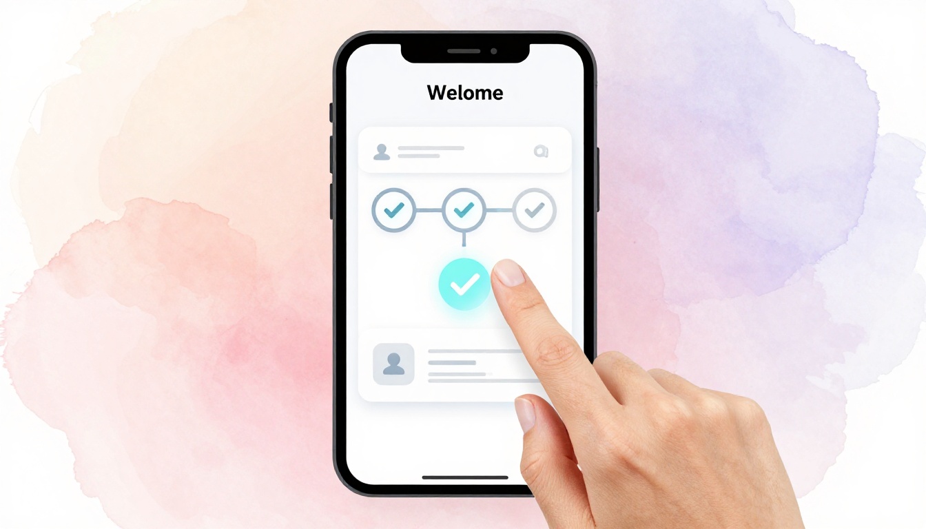
You open a new app, excited to try it. But after three confusing screens and endless fields, you quit. That happened to me last week with a note-taking tool. Studies show 25 percent of users drop off during onboarding.
An intuitive onboarding flow changes that. It guides new users to their first success fast, without frustration. Good design boosts retention and delight.
This post covers why it matters, how to know your users, key principles, building steps, testing, and real examples. Ready to turn drop-offs into daily users? Let’s start.
Why Intuitive Onboarding Turns New Users into Loyal Fans
Poor onboarding kills apps. Users leave because steps confuse them or demand too much upfront. As a result, churn spikes early.
Good flows fix this. They deliver value quick, so users stick around. For example, apps with smooth onboarding see 40 to 60 percent higher activation rates, based on user studies. Retention jumps because people feel capable right away.
Think about Slack. New teams join and chat in seconds. No deep setup needed first. Duolingo hooks you with one easy lesson. These apps build loyalty fast.
Businesses win too. Lower support tickets mean happier teams. Faster time to value speeds revenue. In contrast, bloated flows waste ad spend on ghost users.
Users feel smart, not lost. They share the app because excitement spreads. So, design for that first win. It pays off long-term.
Know Your Users Inside Out to Design What They Crave
Start with people, not pixels. Research shows what they need. Then tailor the flow.
Build personas first. They act as stand-ins for real users. Next, spot pains through quick checks. Finally, match steps to their goals. Empathy drives every choice.
Build User Personas That Guide Every Choice
Personas keep decisions focused. Give them names, ages, jobs, and pains.
Take a fitness app. Sarah is a 35-year-old busy mom. She wants 10-minute workouts. Her frustration? Long sign-ups that eat time.
Mike, 28, loves gym challenges. He skips basics for custom plans. Tech-savvy, he hates slow apps.
Use these to shape flows. For Sarah, offer quick start buttons. Put profile tweaks later for Mike. Personas decide button words and step order. They prevent guesswork.
Uncover Pain Points with Quick Research Tricks
Spot issues early. Use free tools for insights.
Google Analytics reveals drop-offs per screen. Heatmaps from Hotjar show ignored buttons. Short surveys via Typeform ask “What stopped you?” User interviews uncover hidden woes. Session recordings catch real struggles.
Common pains include too many fields, vague next steps, no progress bars, slow loads, and forced logins. Fix them with previews like guest mode or tooltips. These tricks surface fixes fast.
Align Onboarding with User Goals from Day One
Users hire your app for jobs. Onboarding must deliver quick.
For SaaS, prioritize profile setup then first task. E-commerce? Quick cart add. Use jobs-to-be-done: What result do they seek?
Match flows to goals. Busy users get express paths. Power users see options. This alignment boosts completion because steps feel relevant.
Essential Principles That Make Onboarding Feel Like Magic
Principles ground great flows. They work across apps. Apply them after research.
Focus on four: simplicity, personalization, progress, and early value. Each builds trust. Let’s break them down.
Keep It Simple: Fewer Steps, Bigger Wins
Aim for three to five screens max. Users quit overload.
Progressive disclosure hides extras. Show basics first, unlock later. A bloated signup asks 10 fields at once. Lean versions split them, with auto-fills.
Slack nails this. One email, then chat. Simplicity wins because attention spans shrink.
Personalize Without Creeping Users Out
Smart touches feel welcome. Use name after signup. Offer goal paths like “Beginner” or “Pro.”
Get consent for data. Defaults from referrals save time. Spotify suggests based on sign-up source, without spying vibes. Balance builds comfort.
Show Progress and Give Instant Feedback
Progress bars motivate. Checkmarks celebrate steps.
Micro-animations confirm taps. Toast messages say “Saved!” Sounds add delight on mobile. Feedback loops make users feel in control. Without them, doubt creeps in.
Highlight Value Early to Spark Excitement
Tease wins on screen one. “Track workouts in 30 seconds.” Social proof like “Join 1M users” reassures.
End with an aha moment, like first result. This excitement drives shares. Value upfront hooks them.
Build Your Onboarding Flow Step by Step
Now build it. Plan like a recipe: sketch, pick type, prototype. Tools like Figma speed this.
Follow phases for success.
Sketch the Flow: From Welcome to First Success
Outline five steps. Greet warmly. Collect essentials only. Deliver value, like first task. Offer extras optionally. Exit to main app smoothly.
For a project tool: Welcome screen asks goal. Quick team invite. First board created. Boom, success. Sketch on paper first, then digitize.
Choose the Right Flow Type for Your App
Pick based on needs. Linear suits simple apps. Conditional branches on choices. Modular mixes tips anytime.
| Flow Type | Best For | Pros | Cons |
|---|---|---|---|
| Linear | Basic apps like calculators | Fast, no confusion | Less flexible |
| Conditional | Choice-driven like fitness | Personal, engaging | Can overwhelm if branches many |
| Modular | Complex SaaS | Flexible, skippable | Needs strong design |
Linear keeps newbies on track. Test to match your users.
Test Ruthlessly and Iterate to Perfection
Launch is start, not end. Measure and tweak.
Track metrics first. Run tests next. Loop improves flows.
Key Metrics That Tell You If It Works
Focus on five KPIs. Aim for 80 percent completion. Time to value under two minutes. NPS above 50 post-flow. Drop-off rate below 20 percent per step. Activation, like first action done.
Mixpanel or Amplitude track these. Hits mean success; misses signal fixes.
Run Tests and Fix Issues Fast
A/B test variations. Usability sessions watch real users.
Common fixes: Shorten steps from data. Add tooltips for confusion. Sessions reveal “I got stuck here.” Iterate weekly for quick gains.
Steal Ideas from Onboarding Masters
Learn from winners. Copy smart parts.
Airbnb builds trust. Photos, reviews show early. Quick host/guest choice. Lesson: Ease fears first.
Notion starts with template picker. Dupe a ready workspace. Users edit fast. Key: Skip blank slate pain.
Spotify runs a taste quiz. Three questions, playlist ready. Fun hooks music fans. Personal touch delights.
Dropbox skips heavy setup. File upload demo shows value. Simple wins loyalty. Adapt these to your app for proven lifts.
Great onboarding starts with users. Apply simple principles. Test everything.
Audit your flow today. Tweak one step and measure. What change boosted your retention most? Share below.
“Design for the user who opens your app once.” Nail that, watch loyalty grow.