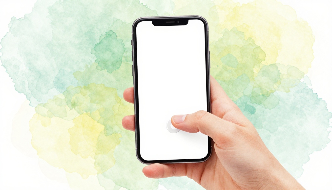
Picture this. You’re rushing through your commute. You tap a button on your phone app. It misses because it’s too high up. Frustration hits as your phone slips.
Stats show 75% of smartphone sessions happen one-handed. Users grip phones awkwardly for hard-to-reach spots. This leads to high bounce rates and lost sales. Thumb zones fix that. They map where thumbs land naturally on screens.
Thumb zones mark easy-reach areas. Green zones sit at the bottom center. Yellow stretches to sides. Red warns of corner struggles. This post breaks down the science. You’ll learn simple steps to place buttons right. Your apps and sites will see better taps and conversions.
What Thumb Zones Reveal About Human Hands
Thumb zones come from real hand science. They show where fingers stretch without strain. Designers use these maps to guide button spots.
Average adult thumbs measure about 2.8 inches long. Men tend to have longer ones. Women often have shorter reach. Hand size varies too. Bigger palms shift the pivot point lower.
Fitts’s Law explains the rest. It says targets work best when close and large. A thumb hits a big bottom button faster than a tiny top one. Think of grabbing your car key fob. You don’t stretch across the dashboard. You keep it near.
Studies confirm this. They track thousands of taps. Results form heatmaps. Hot spots cluster low on screens.
Key Studies That Mapped the Thumb Reach
Steven Hoober tested 133 users in 2017. He watched iPhone and Android grips. Findings? Only 49% used one-handed portrait mode. Yet taps favored the lower screen half.
Heatmaps glowed green at the bottom center. Yellow faded up the sides. Red burned in corners. Baymard’s 2023 UX report echoed this. They benchmarked e-commerce sites. Touch targets under 44×44 pixels failed often.
Gender matters here. Men’s thumbs hit higher zones. Women’s stay lower. Overall, 75-90% of taps land in the bottom half. Place critical buttons there. Users thank you with more clicks.
How Grip Styles Change Everything
Grips shift thumb paths. One-handed lets thumbs arc from the bottom edge. It covers just 30-50% of the screen.
Two thumbs double the reach. Typing expands to both sides. Index finger pokes work for high spots. Cradle holds free one hand.
Portrait mode limits most. Thumbs sweep in a low curve. Landscape opens more area. But people stick to portrait. Test grips in your app. Match buttons to common holds.
Thumb Zones Across Phones, Tablets, and Users
Screens differ. So do users. Thumb zones adapt to size, shape, and hands.
Kids have small thumbs. Seniors grip looser. Big hands cover more screen. Average medium hands reach 72% in portrait. Foldables bend zones mid-screen.
Portrait rules daily use. Landscape fits games. But stats favor portrait. One-handed dominates commutes.
One-Handed vs Two-Handed Realities
Hoober’s data splits it clear. 49% one-hand portrait. 36% use two thumbs. Safe zones shrink to the bottom third for solo grips.
Two hands cover full width. Social apps like Instagram thrive here. Test both. Track drop-offs in analytics. One-handed users bail fast on top buttons.
Bottom thirds win for CTAs. Two-handed setups allow side bars. Balance for your crowd.
Screen Size and Device Tricks
Small phones under 6 inches give full bottom access. No stretch needed. Phablets over 6.5 inches hide corners. Thumbs can’t curve that far.
Tablets demand fingers. Thumbs fall short. Scale zones with viewport size. Use media queries in CSS.
Dynamic nav helps. Bottom tabs beat side menus. Users stay engaged longer.

This visual shows how zones shrink on bigger screens. Adjust your layout accordingly.
Smart Button Placement: Rules That Boost Taps
Place buttons smart. Put CTAs in green zones. Make them 44×44 pixels minimum. Right-handers curve thumbs bottom right.
Instagram nails stories. Swipe up sits easy. Twitter puts compose bottom right. Reach feels natural.
Balance looks with function. Don’t cram everything low. Use ghost buttons up high for less urgency.
Golden Spots for Your Must-Tap Buttons
Bottom center holds nav bars. Thumbs rest there. Primary CTAs go bottom right. Search icons fit middle bottom.
Skip top corners. They demand two hands. Ditch hamburger menus. Bottom tabs cut taps by 20%.
Test flows. Users scan low first. Guide them with placement.
Mistakes That Kill Conversions and Fixes
Top-right floats frustrate. Modals center OK off thumb path. Users poke air.
Fix with A/B tests. Tools like Hotjar map heat. Spotify shifted play buttons low. Taps rose 20%.
Audit your site. Move one button today. Watch metrics climb.
Test and Tweak for Thumb Perfection
Testing proves zones work. Start with Figma overlays. Sketch arcs from thumb pivots.
Track taps in Google Analytics. Spot drop-offs. User tests via UsabilityHub reveal pain.
Iterate fast. Small changes lift engagement 15-30%. Real data beats guesses.
Quick Tools to Map Your Own Zones
Grab Hoober’s zone generator. It’s free online. Draw your screen. Overlay arcs.
Adobe XD offers thumb plugins. Color code green to red. Steps stay simple: grip phone, trace reach, adjust UI.
Run prototypes. Get feedback. Polish for all users.
Thumb zones build intuitive apps. Science shows low buttons win taps. Hands prove it every scroll.
Audit one screen now. Shift that buy button. You’ll cut friction fast.
Share your redesign wins below. What lift did you see? Subscribe for more UX tips. Frictionless mobile awaits.
(Word count: 1,482)